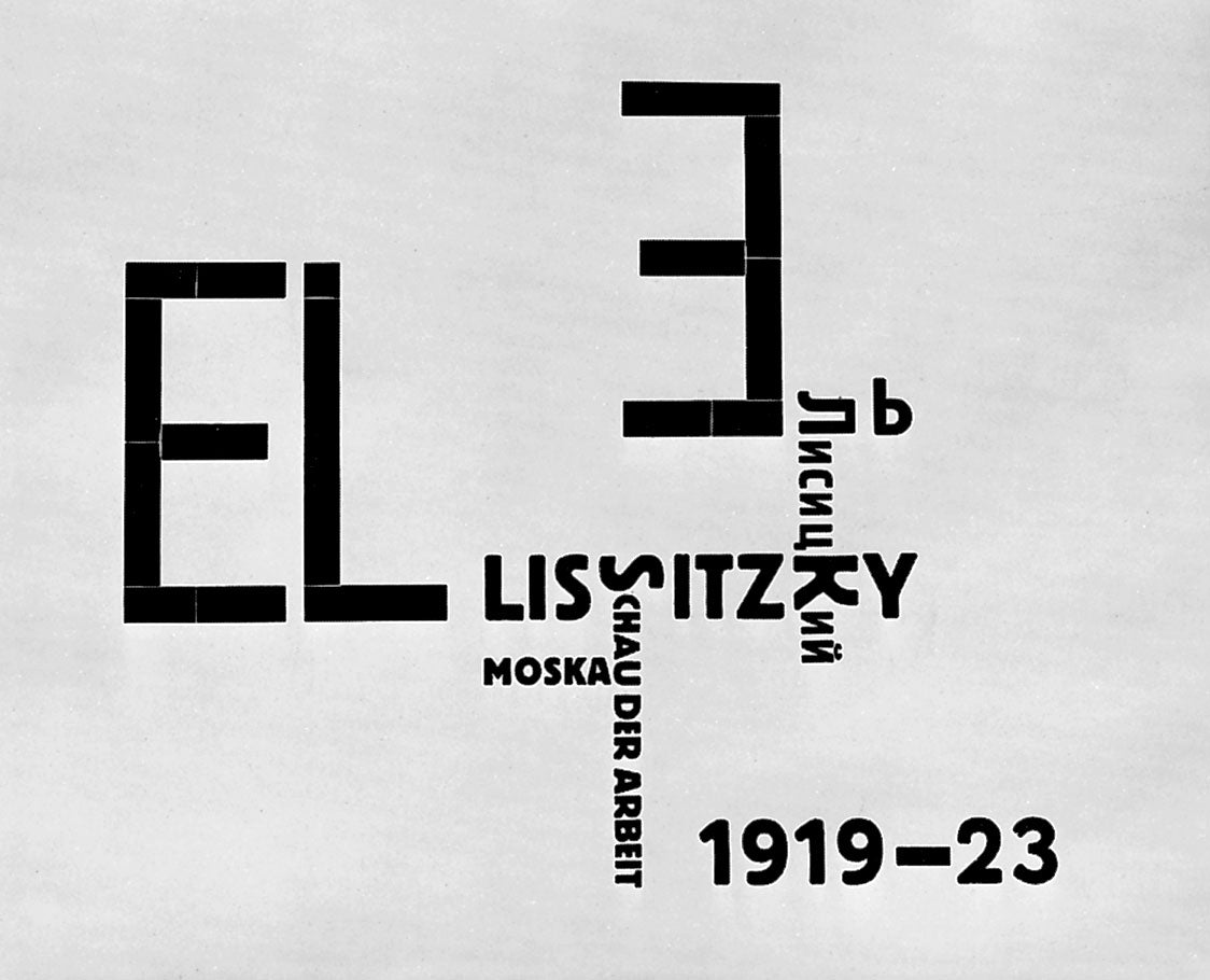
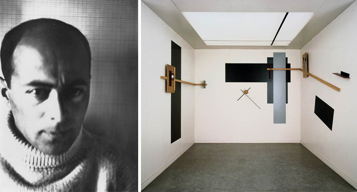
El Lissitzky is one of our favorite artists. He worked not only as a painter but also as an architect, graphic designer, and photographer, and was one of the founders of the Russian Suprematist art movement, where artists create based on “the supremacy of pure artistic feeling” rather than realistic representation. His bold, graphic, and geometric paintings known as PROUNS - and his talent across so many design platforms - inspired the mood and custom font creation for the Alphabet Edition.


Posted in
art,
edition,
el lissitzky,
Metalepsis Projects
Hello - thanks for stopping by to check out the news on our recent projects, events, and press! For even more inspiration, visit our tumblr and pinterest pages linked in the navigation bar.
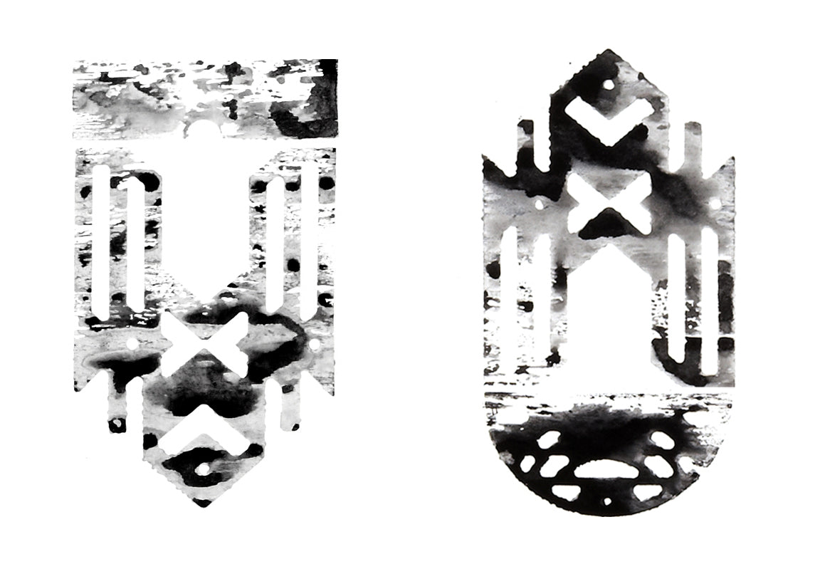
For our inaugural post we thought we'd revisit one of our favorite art projects: a series of india ink prints that accompanied the Element Edition. These prints are enlarged woodcuts in the same modular geometries of the edition's bronze necklace pendants. To make them we drafted the outlines of the shapes in CAD software, then used a CNC mill to cut the shapes out of plywood. The plywood printing plates were then brushed with india ink and stamped on paper. Each piece comes out as a watery but bold graphic that further explores our interest in the gray area where mass production and customization overlap.


Posted in
art,
edition,
Metalepsis Projects
