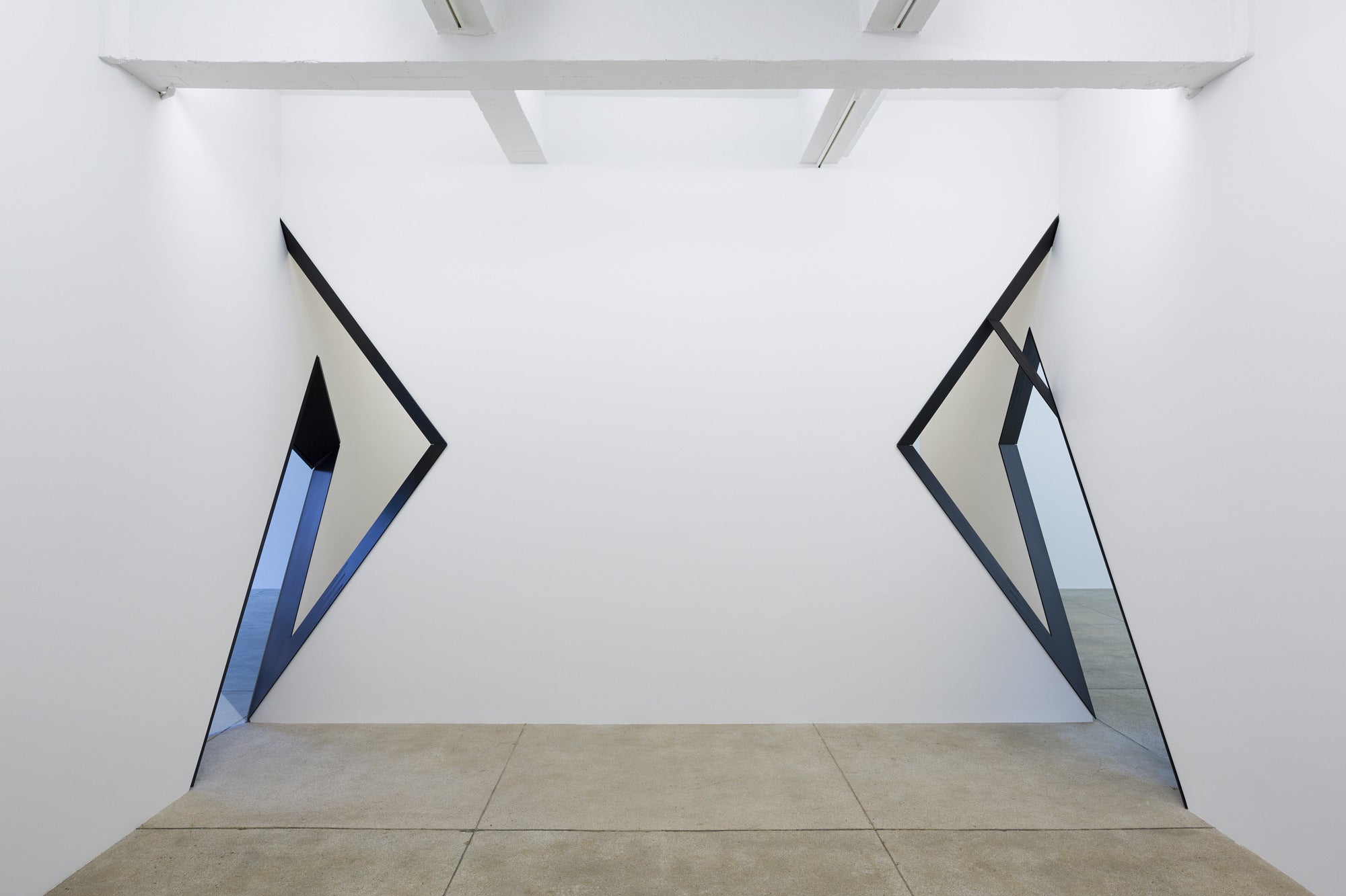
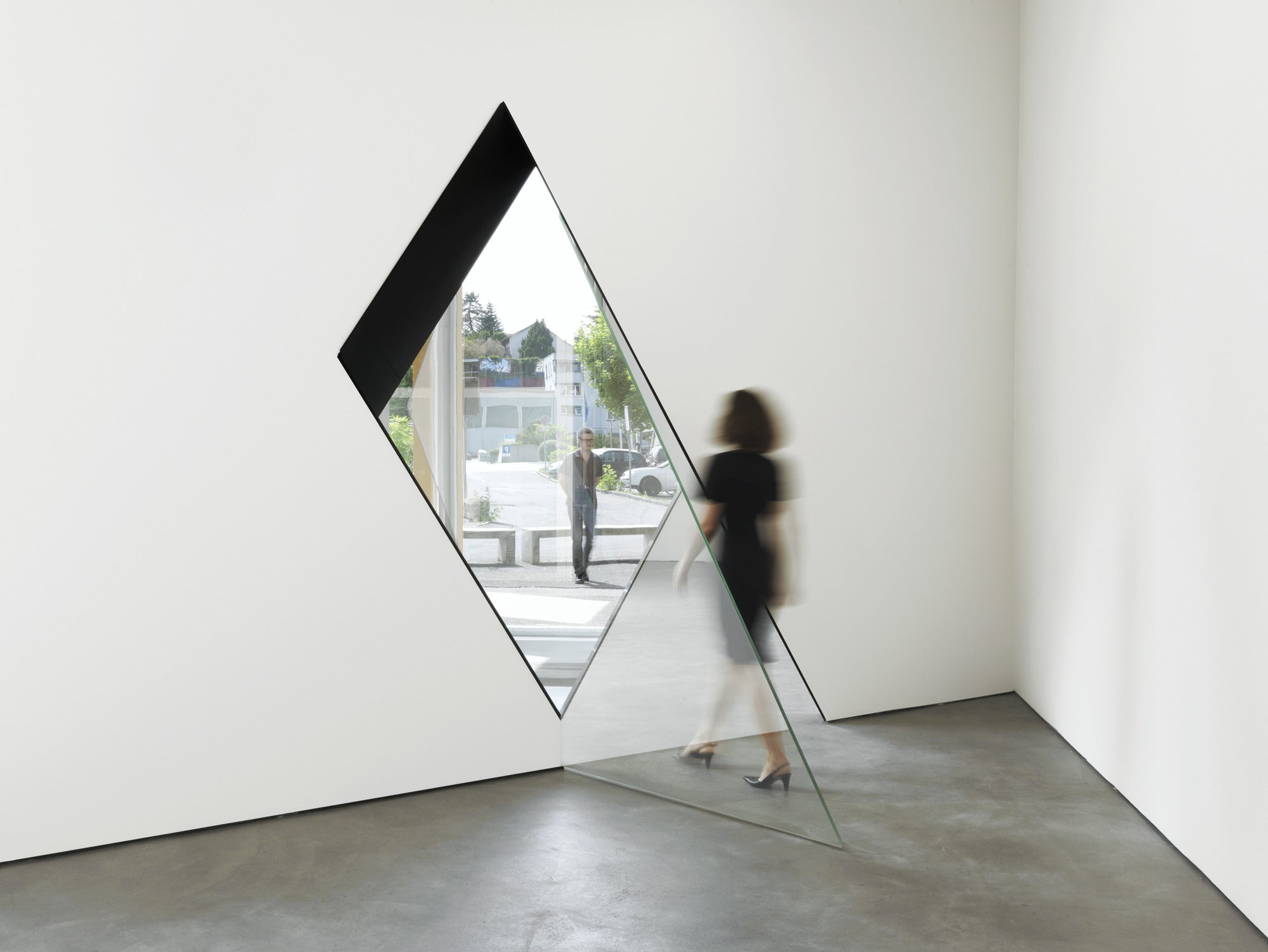
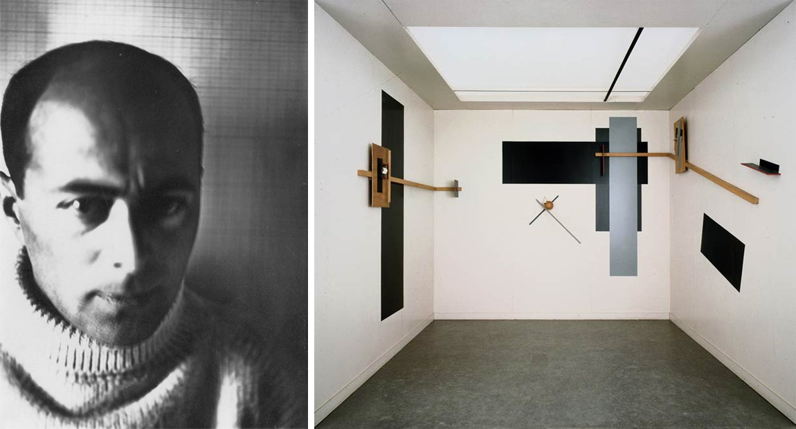
Sarah Oppenheimer creates installations that make the viewer question the physical space. She obscures and transforms ordinary rooms into spaces that manipulate the viewer’s perception of the physical space. She cuts angled holes in the walls to abstract the corners, making them seem like they could open like an accordion while waking through them. Visitors have even reported cases of vertigo. Although it is possible to walk through the holes, it still requires you to be very aware of your movements.
The lighting in the room plays an important role in contributing to the overall feeling. Oppenheimer adjusts the lighting according to what the predicted temperature of light in each room will be, and adjusts the illumination so that the solid painted white walls contain various tints. From a distance, the corners almost appear as abstract flat surfaces.


Posted in
architecture,
art,
design,
gallery,
oppenheimer,
sculpture,
space
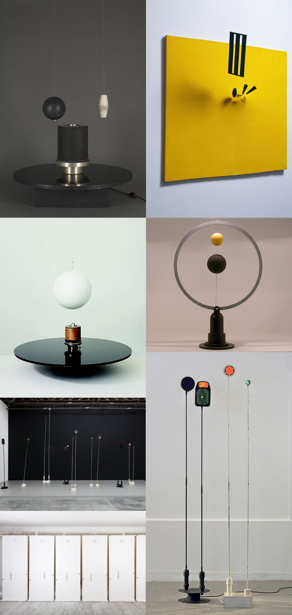
Takis is a kinetic artist living and working in Greece. His work focuses on electromagnetism, a force he describes as a fourth dimension that “binds together in space, objects, metals, roaming particles of the cosmos.”
Magnets play a vital role in the function of his sculptures. Magnetic Painting No. 7 (1962) uses strong magnets behind a solid yellow canvas to make metal objects float in front of the painting’s surface. In another one of Takis’s works, Ballet Magnetique I (1961) he makes a metal sphere hover and orbit above the surface of the sculpture with the use of an electromagnet.
The concept of magnets and suspension has inspired us to think differently about the design of our upcoming spring collection. Everything from the materials to the closures will be an integral part in the design of jewellery.
Posted in
art,
artist,
design,
magnets,
metalepsis,
metalepsis projects,
sculpture,
takis,
technology
Recently I saw a play called "Une nuit Radieuse" (a radiant night) which basically spins off the famous Urban design concept "Ville Radieuse" (radiant city) by which Le Corbusier was quite famous for (besides his furniture you've seen at DWR or MoMA)
The play uncovers a small fraction of his persona, as a human, as man, as a husband, who enjoys the routine of swimming every morning in the French Riviera and painting in his one-bedroom cabin Le Cabanon.
Had I not seen, studied, and fantasized enough of his architecture marvels. This is a little exploration of his paintings, engravings and drawings that he started before and after he realized he was to become the Modernist architect, par excellence.

(top right) Geometric motifs 1912 | (bottom left) Three bottles 1926


(L) engraving- The Modulor (1956) | (R) Icône 3, 1956
 Drawing for many tapestry designs for Chandigarh
You may also find more info and works by Le Corbusier here.
Posted in
architecture,
art,
engraving,
frenchswiss,
Le corbusier,
painting,
urban design
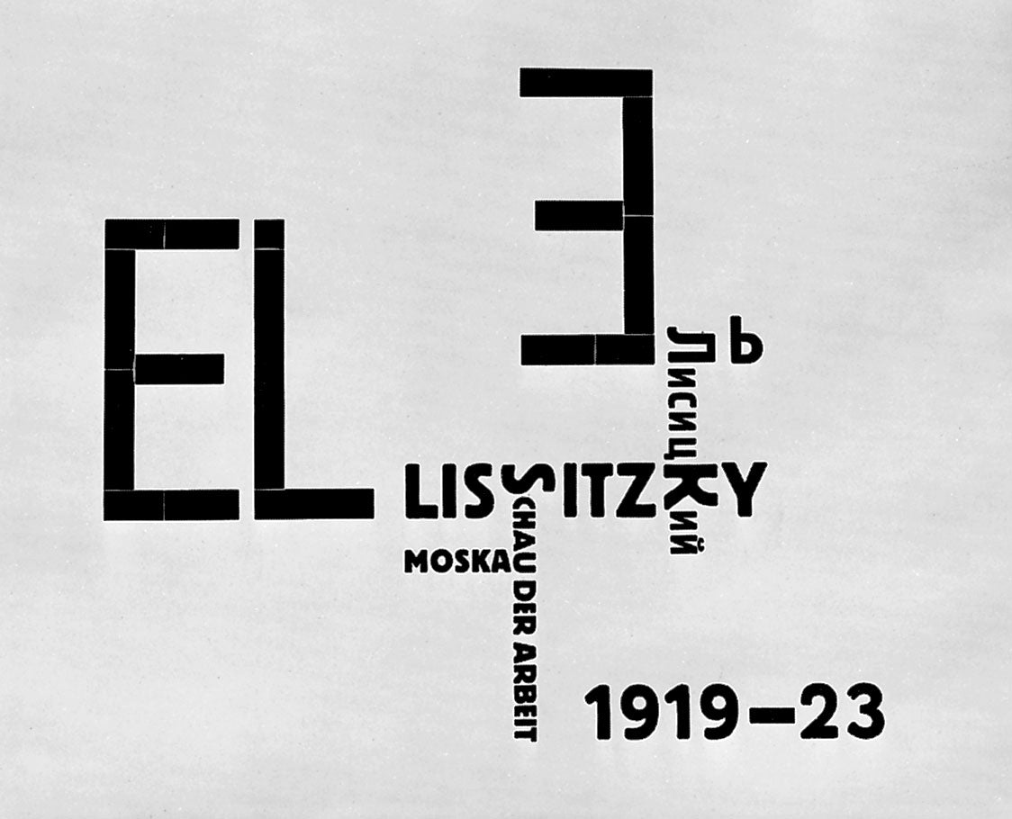
El Lissitzky is one of our favorite artists. He worked not only as a painter but also as an architect, graphic designer, and photographer, and was one of the founders of the Russian Suprematist art movement, where artists create based on “the supremacy of pure artistic feeling” rather than realistic representation. His bold, graphic, and geometric paintings known as PROUNS - and his talent across so many design platforms - inspired the mood and custom font creation for the Alphabet Edition.

Posted in
art,
edition,
el lissitzky,
Metalepsis Projects
Hello - thanks for stopping by to check out the news on our recent projects, events, and press! For even more inspiration, visit our tumblr and pinterest pages linked in the navigation bar.
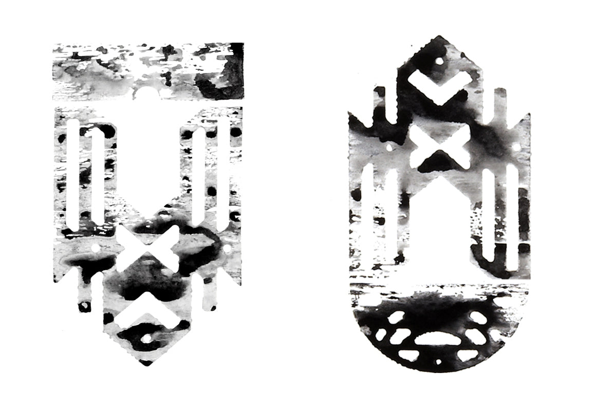
For our inaugural post we thought we'd revisit one of our favorite art projects: a series of india ink prints that accompanied the Element Edition. These prints are enlarged woodcuts in the same modular geometries of the edition's bronze necklace pendants. To make them we drafted the outlines of the shapes in CAD software, then used a CNC mill to cut the shapes out of plywood. The plywood printing plates were then brushed with india ink and stamped on paper. Each piece comes out as a watery but bold graphic that further explores our interest in the gray area where mass production and customization overlap.

Posted in
art,
edition,
Metalepsis Projects


 Drawing for many tapestry designs for Chandigarh


